NPS isn't particularly useful
What is this post?
In this post, I hope to convince companies and their investors to stop using Net Promoter Score (NPS) as a KPI. NPS fails on basically two dimensions: first, it doesn’t say very much. Second, it suffers from an unreasonable amount of variance, which makes interpretation potentially misleading.
NPS doesn’t say anything particularly useful.
To understand what makes a bad business metric, I find it helpful to set two organizing principles that characterize effective business metrics.
Effective business metrics are inputs (even indirectly) to free cash flow.
I like to imagine all business metrics arranged in a pyramid. At the top of the pyramid sits free cash flow. That’s because, excluding social responsibility initiatives, long-term free cash flow generation is the ultimate outcome. It’s why the business exists. Everything else is either an input or irrelevant.
Beneath free cash flow, we can imagine inputs arranged hierarchically. For instance, maybe the first layer has “things that put cash into the business” and then “things that take cash out of the business." Then as we go down into deeper layers, we run into more familiar operational metrics, e.g. CAC, churn, average sale price, attachment rates, etc. It’s easy to forget — the only reason these things matter is because they help to determine free cash flow (even if FCF is deferred for many years!).
You’d have to squint to see how NPS maps to free cash flow generation more tightly than alternative metrics.
The most reasonable defenses of NPS I’ve gotten roughly adhere to two themes. First: that NPS matters because it’s a correlate of growth; second: that it’s a helpful measure of customer satisfaction, which in turn predicts retention. In either case, I’m tempted to wonder why companies don’t do the work to find internal metrics designed specifically for their own product and their own customers. At the very least, you could suss out the dimensions of customer satisfaction across multiple questions.
(The most irritating — and by far the most common — reason companies seem to measure NPS is that it’s standardized, but more importantly that everyone else does it. Which is fine for one-time-use benchmarking, but not a good basis for internal KPIs.)
Effective business metrics have clear interpretations that inform decisions.
Most business metrics have a pretty clear interpretation. For example, we can model out the consequences of a 10% increase in CAC, and we can pretty intuitively guess why that would happen.
It’s extremely difficult to guess what happens when your NPS increases from +0 to +10. Will your growth accelerate? How much? When? Is that different from your NPS increasing from +10 to +20? If so, by how much? What other metrics — if any — would typically move when that happens?
The ambiguity of NPS makes it extremely difficult to understand its inputs. If NPS decreases from +10 to +0, you’re left wondering why. Does that actually represent a diminished user experience ?
Most importantly, it’s not realistic to set NPS goals. If I can’t tell you the business implications of a +25 NPS , and if I can’t know the relevant inputs (i.e. resources) to get there, on what grounds can I establish +25 NPS as a goal? If I’m unable to set a thoughtful goal for NPS, using it as a KPI leaves me ambiguously demanding that it move up and to the right over time. As a result, we’re left with a hazy, binary interpretation — either it’s getting worse or getting better over time — that’s ill-suited to high performance organizations.
NPS is impractically sensitive.
We can go back and forth about the theoretical merits of NPS, but I think it’s more helpful to show simulated examples of how it goes wrong. (I’ve seen many of these firsthand, largely in my time as a private equity due diligence consultant. But I thought the best way to show it would be via simulation.)
I simulate NPS using the following general structure:
Assume an underlying distribution for customers’ propensity to recommend your product or service to a friend or colleague.
Simulate an NPS survey as randomly sampling respondents from the underlying distribution.
For each respondent to the NPS survey, assume they give answers that are correct on average, but nonetheless sampled with some variance.
Convert respondents’ answers on each NPS survey to a single NPS score.
Simulate multiple NPS surveys and compare their one-NPS-score results (recall that each survey will have sampled from the same underlying distribution).
1. Underlying distribution
As a starting point, I assume the underlying distribution is (basically) a beta distribution, except I convert it to a discrete distribution for simplicity. Note that I’m assigning a probability for each value in the set {0.00, 0.01 … 9.98, 9.99, 10.0} that’s determined by the shape parameters of the beta distribution.
build_truncated_distribution <- function(shape_1, shape_2) {
  probability_increment <- .001
  index_lower_bound <- 0 + probability_increment
  index_upper_bound <- 1
  df_to_return <- data.frame(seq(index_lower_bound, index_upper_bound, probability_increment))
  colnames(df_to_return) <- "sequence"
  df_to_return$probabilities <- pbeta(df_to_return$sequence, shape_1, shape_2) - pbeta(df_to_return$sequence - probability_increment, shape_1, shape_2)
  df_to_return$probabilities <- ( 1 / sum(df_to_return$probabilities )) * df_to_return$probabilities
  df_to_return$sequence <- 10 * df_to_return$sequence
  return(df_to_return)
}
2. Sampling from the distribution
Given that distribution, I sample some number of draws. Again, each of these will have 3 significant digits so that we retain some of the shape of the underlying distribution in large samples.
draw_sample_from_distribution <- function(num_draws, shape_1 = 5, shape_2 = 2) {
  underlying_distro <- build_truncated_distribution(shape_1, shape_2)
  to_return <- sample(underlying_distro$sequence, size = num_draws, replace = TRUE, prob = underlying_distro$probabilities)
  return(to_return)
}
3. Converting to survey responses
Then, for each sample from the underlying distribution, I simulate what the NPS survey responses would have been. In this case, I simply add a normally distributed error term with mean 0.
In essence, I’m assuming people accurately report their underlying likelihood to recommend a product on surveys on average, but with a little bit of randomness for an individual. I’m also saying that random error is uncorrelated with a respondents’ underlying likelihood to recommend.
We should recognize at this point that we’ve introduced two sources of variance already: first, a sampling error; and second, a reporting error at the individual level.
convert_sample_to_survey_score <- function(sample, std_dev = .1) {
  to_return = sample
  for (i in 1:length(to_return)) {
    new_val <- round(to_return[i] + rnorm(1, 0, std_dev))
    if(new_val > 10) { new_val <- 10 }
    else if(new_val < 0) { new_val <- 0 }
    to_return[i] <- new_val
  }
  return(to_return)
}
3. Converting to NPS scores
Then I simply calculate an NPS score.
convert_sample_to_NPS_score <- function(sample) {
  count_in_sample <- length(sample)
  count_promoters <- 0
  count_detractors <- 0


  for (i in 1:count_in_sample) {
    if(sample[i] >= 9){
      count_promoters <- 1 + count_promoters
    }
    else if(sample[i] <= 6){
      count_detractors <- 1 + count_detractors
    }
  }

  diff <- count_promoters - count_detractors
  to_return <- diff / count_in_sample
  return(to_return)
}
3. Simulate different draws
Then I repeat the process multiple times
pull_n_NPS_draws <- function(num_of_draws, num_for_each_draw, shape_1, shape_2, error_size) {
  sequence <- seq(1, num_of_draws, 1)
  return_df <- data.frame(sequence)
  colnames(return_df) <- "sequence"

  temp_list <- vector(mode = "numeric", length = num_of_draws)

  for (i in sequence){
    temp_list[i] <- pull_NPS_draw(num_for_each_draw, shape_1, shape_2, error_size)
  }

  return_df$NPS <- temp_list
  return(return_df)
}
This gives us some useful results.
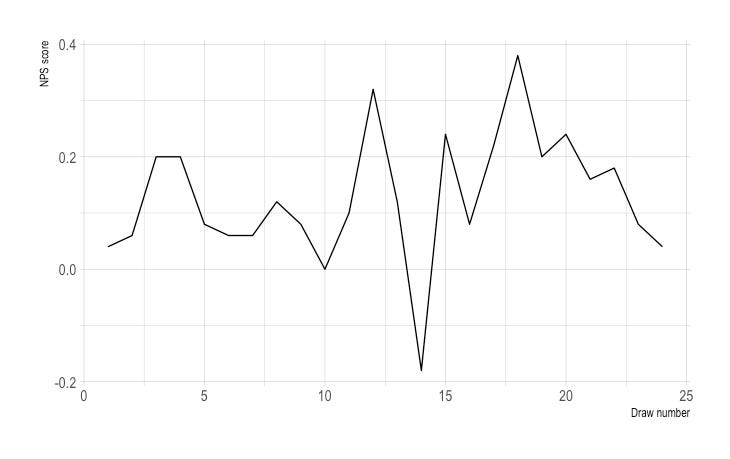
First, let’s look at this the way most companies would, in practice. Here, I take 24 draws of 50 respondents; recall that each of the 24 draws samples the same distribution (a beta distribution where alpha is 5 and beta is 2 — with a survey response error ~N(0, 9/16)).
Now imagine you’re an executive. You’ve asked the team to track NPS month-to-month as your customer experience KPI. You see a chart like this. You might be tempted to say something like “our customers are increasingly dissatisfied!”
But of course, any trend here is a phantom trend. In each of these months, the underlying distribution is exactly the same. And yet we see a radical range of values from around -20 to around +40.
NPS_draws <- pull_n_NPS_draws(num_of_draws = 24, num_for_each_draw = 50, shape_1 = 5, shape_2 = 2, error_size= 0.75)
NPS_ggplot <- ggplot(NPS_draws, aes(x = sequence, y = NPS)) + geom_line() + theme_ipsum() + xlab("Draw number") + ylab("NPS score")
NPS_ggplot
You might be tempted to say that variance is entirely a consequence of a low sample size, as if companies would never report NPS on a sample size of 50 (For what it’s worth, I’ve been required multiple times in my career to report NPS on an N of < 10 ).
Let’s repeat the same exercise with a large sample.
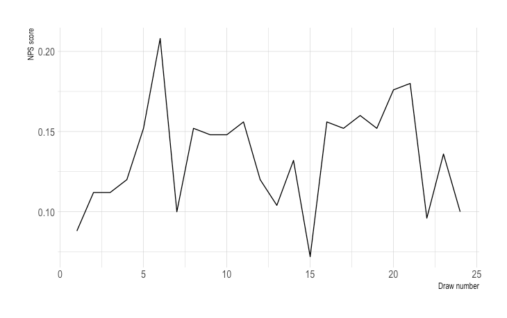
Note that the magnitude is compressed with a sample size of 250. (By the way … good luck getting 250 responses to an NPS survey if you’re not a very large company!)
But we still have problems. There are several very large changes. For example, from months 6 to 7, we have a calamitous drop from over +20 to just +10.
Imagine being responsible for NPS. An executive drags you into a room to explain a 10 point drop. “Our score dropped 50%! We surveyed 250 people this month and last month! This has to be statistically significant,” they might say.
You suggest that it might be a random artifact of the data. Of course, that’s exactly what this is. But nobody will take you seriously if you say so. NPS is an industry standard. It’s your KPI. It’s your job to make it go up. But it’s also extremely volatile.
NPS_draws <- pull_n_NPS_draws(num_of_draws = 24, num_for_each_draw = 250, shape_1 = 5, shape_2 = 2, error_size= 0.75)
NPS_ggplot <- ggplot(NPS_draws, aes(x = sequence, y = NPS)) + geom_line() + theme_ipsum() + xlab("Draw number") + ylab("NPS score")
NPS_ggplot
It’d be reasonable to wonder what a realistic amount of variance would be month-to-month. That’d help you to understand what’s just noise in the data.
I drew 1,000 different NPS scores, each of which was based on 75 responses.
Please remember that this is entirely dependent on the underlying distribution of customers’ likelihood to recommend in the population (which you will never be able to observe directly) and the sample size, which is likely to vary month to month and complicate things.
Nonetheless, this is the part that I see as abundant reason to avoid NPS.
Around 10% of the time, the NPS score was negative
25% of the time, the NPS score was less than +5
25% of the time, the NPS score was more than +20
Of course, you’ll likely never sample 1,000 NPS surveys with 75 respondents for your business. So you’re quite likely to get junk data and never know it.
NPS_draws <- pull_n_NPS_draws(num_of_draws = 1000, num_for_each_draw = 75, shape_1 = 5, shape_2 = 2, error_size= 0.75)
quantiles_to_display$values <- quantile(NPS_draws$NPS, quantiles_to_display$q)
quantile_gg <- ggplot(quantiles_to_display, aes(x = q, y = values)) + geom_bar(stat = "identity") + theme_bw() + xlab("quantile") + ylab("NPS scores")
quantile_gg
A few last thoughts
NPS is vague and noisy; it’s a bad KPI. Let’s just track actual business operations. And if we want to go deep into customer satisfaction, we can ask a small panel of customers several detailed questions. These will surface insights and actually inform strategic decisions.


